The Sufferfest
In-House Designer
Company Overview
The Sufferfest app helped cyclists overcome the monotony of indoor training to achieve fitness and race goals. The business began by selling workout DVDs but later transitioned into a subscription-based multi-platform training app that included training plans, access to coaches, multiple workout disciplines, world records, and more. The app grew to serve 80 plus thousand users by the summer of 2022.
My Role
User Interface and Experience Design (UI/UX)
Marketing Materials
User Research
Wireframes/prototypes
Illustrations
Quality Control
I was the team's only UI and UX designer for the first four years. Eventually, they hired Chris Blom as the Creative Director. When the Sufferfest merged with Wahoo Fitness, he built out a team of designers. Much of the work I'm showing here was done by myself and in collaboration with Reid Weber(Product Owner) and David McQuillan(CEO).
Project Overview
I was an in house designer for the Sufferfest, who eventually merged with Wahoo Fitness, for about 7 years.
The CEO(David McQuillian) had already been selling DVDs and Downloads of the workout videos for three years proving demand for the product. Also a couple other apps in the space, had already established a following. Sufferfest partnered with a few of them to showcase their workouts. TrainerRoad and Strava were among them.
Eventually Sufferfest approached Reid Weber who was a ex-partner of Trainer Road to create a new app. Reid hired me and a few programmers to design and build the Sufferfest App.
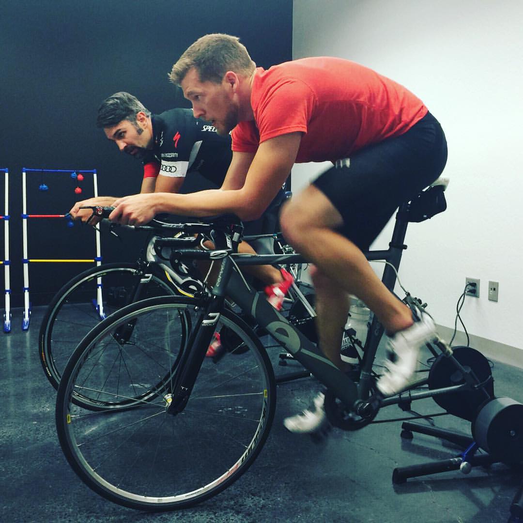
We fleshed out user flows, wireframes and prototypes to test the usability of the app and built a working prototype which we shared with beta users. For the majority of my time with Sufferfest we would work on the application during the day and test ride in the evening. We interviewed beta users, encouraged friends and family to use the app in front of us, and meticulously created solutions to improve the app.
Reid Weber and myself testing the application. Photo by Josh Levine, the lead programmer.
Wireframes
Here are a few wireframes I did to flesh out the app layout. This is only a few examples. I have no idea how many wireframes we went through over the years. I would use Invision to create prototypes for the rest of the team to review and even use with testers to ensure we were headed in the right direction.
A personal goal I strove to accomplish was to keep the application simple enough that we didn't need any wizards or instructions. For the most part, we succeeded.
Designs
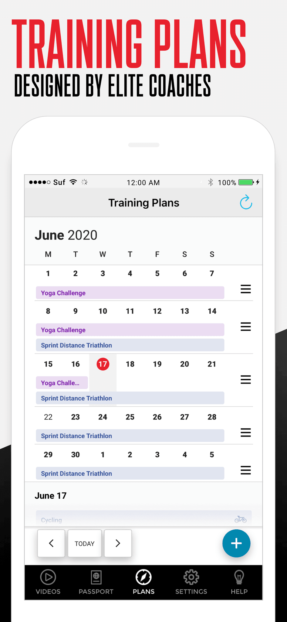
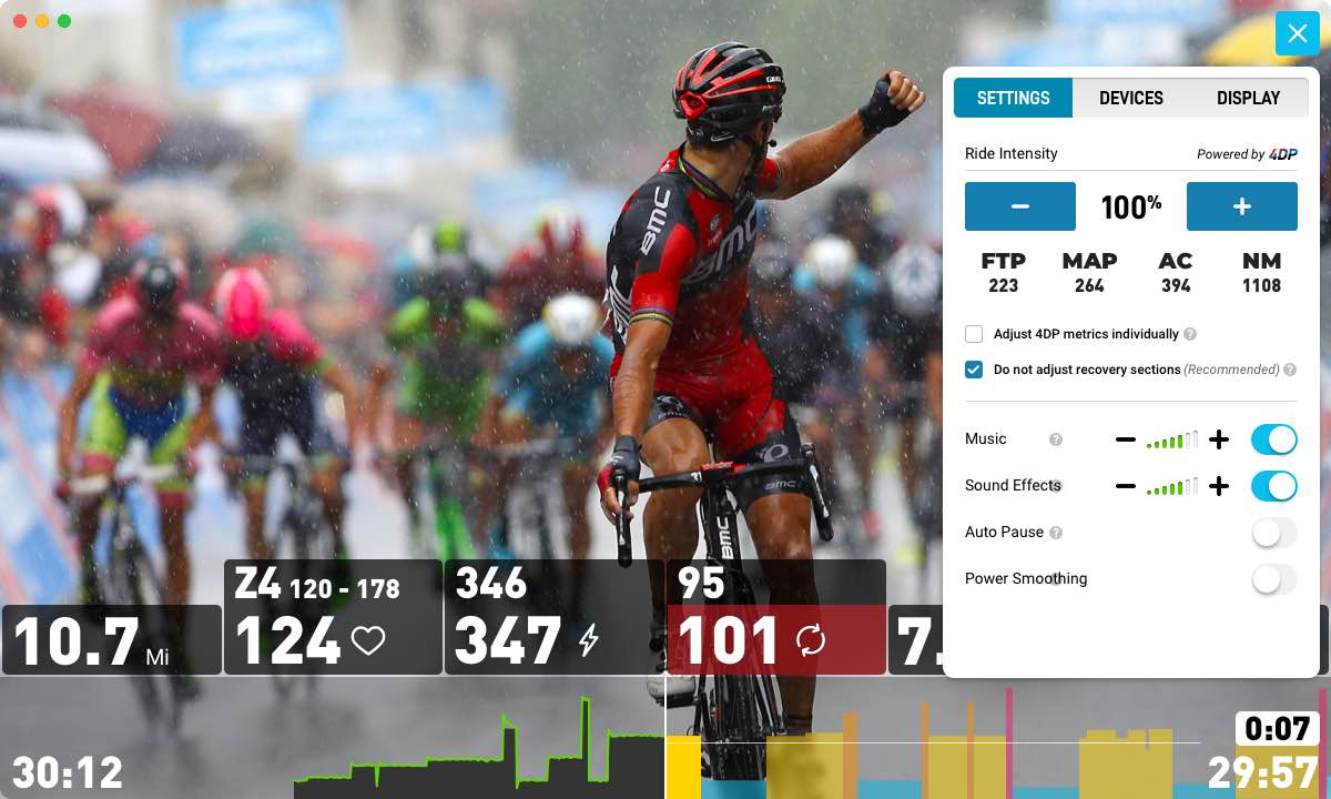
The Sufferfest transformed a lot over the years. I was tasked with designing new features constantly. Those features included, data tracking, bluetooth device connection, immersive workout players, training plan calendars, gamification, and the list goes on. Working with our Sport Science department I made their vision of scaling a workout to the athlete's needs a reality and a fitness app first. At the time no other application was doing this on the market.
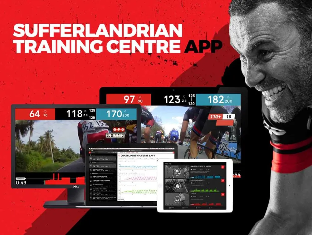
Results + Lessons
Working with a small team, we created an app that took a leading spot, setting the standard for fitness apps moving forward. Constant iteration and testing were key to getting the desired results. Last I heard, the app is now serving 80+ thousand users.
Several of our athletes set world records, some lost hundreds of pounds, and others loved our platform so much they got tattoos showcasing their loyalty. I personally performed three Knighthood challenges with out users. The Sufferfest will always have a special place in my heart.
Three years of information was a lot to pack into this case study. Please get in touch with me if you want clarification or to see more content.
YouTube review by DC Rainmaker. This review was done when I was still the team's only UI/UX designer.
Let's Talk
Book a chat with me to discuss how we can achieve great results for your company.
Neither he who plants nor he who waters is anything, but only God who gives the growth.
1 Corinthians 3:7
